M&H is an engineering and consulting firm comprised of experts from various specialties who coordinate their activities to help oil and gas, refinery, industrial and manufacturing clients around the world build and safeguard the integrity of their physical assets.
Challenge: M&H’s logo, web site and collateral materials belied the company’s size, global capabilities and impressive project portfolio. There was no indication of how effectively M&H’s business units could work in concert to create a total solution for clients. In addition, although the company is well-known for its oil and gas work, it didn’t want to be known only as a provider for just one industry.
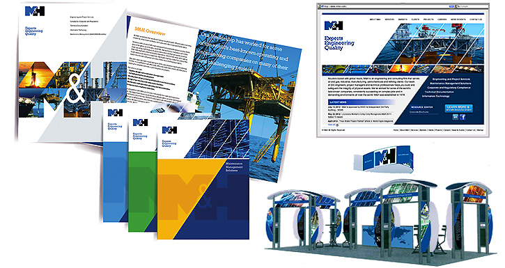
Solution: The first step was to update the brand identity. The new, modern logo emphasizes the partnership among the company’s business units, with the letters M and H essentially becoming integrated. The slant of the M also created the platform for a design denoting action and forward thinking. This has been applied to the company’s marketing materials, including web site, trade show installations, and print communications.
In business for more than 30 years, the company is recognized for its engineering expertise among oil and gas clients. In order to increase awareness among other industries, as well as to communicate the broad service offerings that complement its engineering competency, we developed a “limitless” tagline: Experts Engineering Quality.

For more than 40 years, Artisan Field has helped businesses communicate effectively through evolving visual media. A multi-disciplinary graphic design and marketing communication firm, Artisan Field has attracted a diverse client base, ranging from start-up businesses to Fortune 500 corporations across multiple industries worldwide
